5 easy to implement tips to improve the mobile checkout design of your ecommerce website

We recently started a series of deep-dive articles, building on the findings from our “Online Shopping Behaviours of Today’s Australians” report that was released earlier this year. The report was based on generational research into the attitudes & perceptions of Australian eCommerce consumers, carried out by our Experience Design team, and touched on a number of important topics for anyone responsible for the success of an online store.
Our first article looked at shopping cart best practices and methods to improve conversion rates during checkout. This follow-up piece goes deeper, looking at how to optimise your checkout process for customers using a mobile device.
Obviously, mobile device screen real estate is limited compared to on a desktop computer, so consideration should naturally go into the layout and design of key elements of your interface. There are, however, a number of additional device-specific features and techniques you can employ to further improve the UX of your eCommerce checkout process. Leveraging these techniques will make the overall checkout experience faster, easier and more intuitive, resulting in a decrease in abandonment and an increase in conversions.
Ready? Let’s dive in!
5 East to Implement Tips
There are numerous ways to improve the UX of your checkout form for your mobile eCommerce site. We’ve chosen five easy to implement tips and tricks that you can tweak on your site that will allow you to avoid user churn and gain instant return. While we always recommend conducting Usability Testing before releasing any new features to your audience, these tips have been proven to be effective and so are a good place to start on your optimisation journey.
Tip 1: Match Keyboard & Input Type
A simple, yet widely overlooked usability consideration, is matching the keyboard to the input field within a form a user has tapped on. A numeric keyboard should be offered to users inputting credit card details, phone numbers etc. While an alphabetical keyboard option should be used for fields such as name and address.
This may seem simple and unnoticed by users, but if you are failing to use the correct keyboards users will notice instantly and will let you know by simply churning from your site and could be driving untold lost conversions.
We’ve found that a mix of ‘inputmode’ and the iOS-specific ‘pattern’ attribute yields good results:
<label for="creditcard">credit card number:</label>
<input inputmode="numeric" pattern="[0-9]*" type="text" name="creditcard">
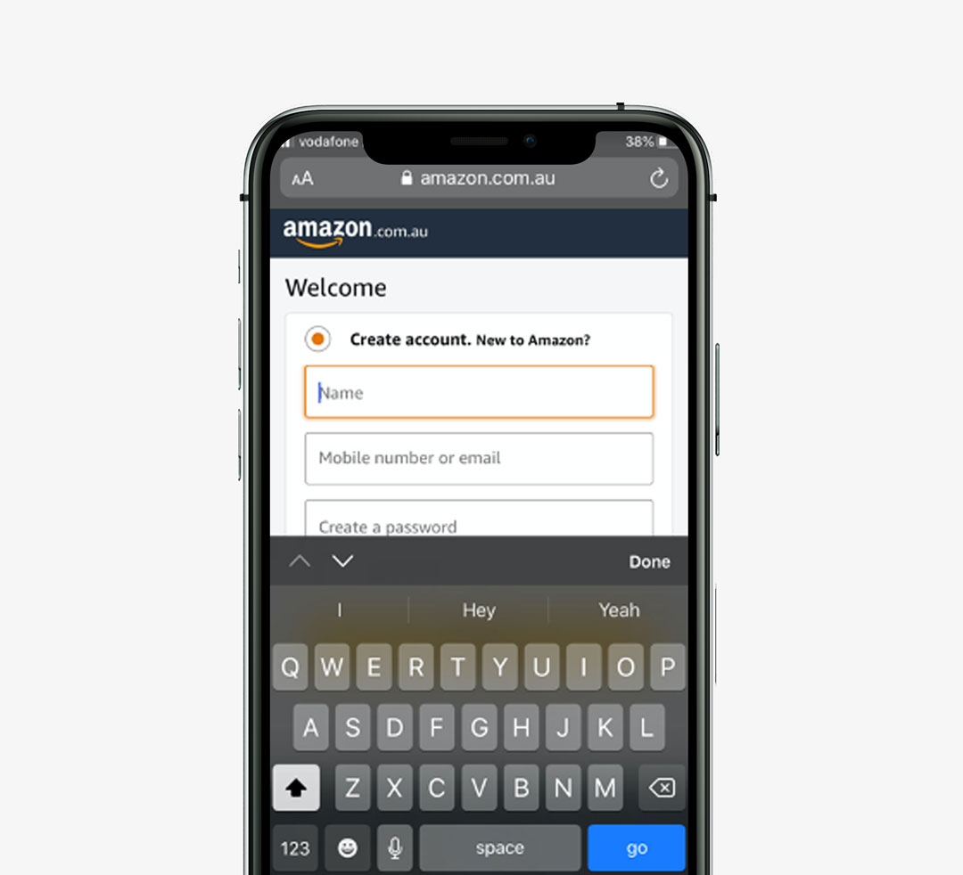
Amazon provide match correctly match keyboard to input type.
Tip 2: Perform Inline Validation of User-Entered Information
When users are moving through your form inputting their data into fields during the checkout process it is important to provide them with overt and immediate cues as to whether they are correct or incorrect.
Methods of communicating these errors or successful progress include symbols, error text or highlighting the fields themselves.
This allows you to indicate quickly and decisively to your users that they have made an error and they will have to edit and resolve the error to progress.
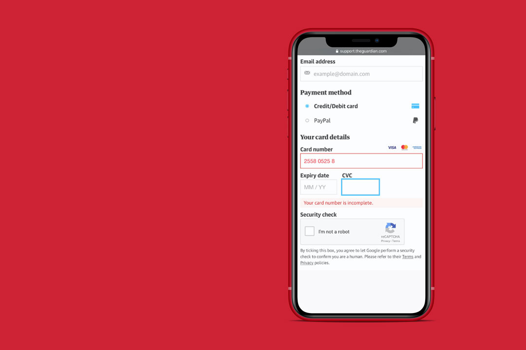
The Guardian chooses to highlight user error by highlighting the error field.
Tip 3: Provide Piece of Mind & Confidence in Website Security
When it comes to purchasing and the environment we currently live in, users will naturally look for security safeguards when it comes to making a monetary transaction using your site.
Common ways to improve the feeling of security to your users include buttons and icons that communicate safety to a user.
Users have become trained to look out for these security cues on forms e.g. padlock icons, overlooking these elements will lead to distrust in the eyes of users.
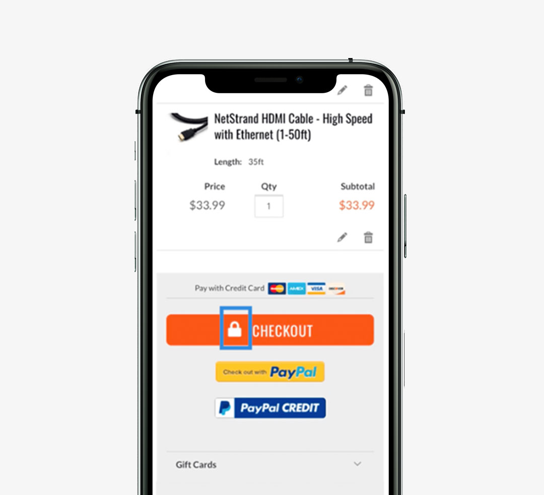
Carphone Warehouse UK provide users with security reassurance via padlock icon.
Tip 4: Leverage Autocomplete to Reduce Errors
More often than not, users will make errors if they are asked to type their data into text fields. This is accentuated on mobile given the dimensions we are working with.
If you have access to your user’s data, consider completing fields automatically e.g. name and address or using geolocation technology for their location.
If you don’t have this information stored, consider using smart search fields which can expedite a user’s experience as they flow through your form.
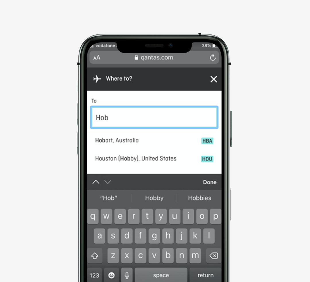
Qantas help users out by leveraging smart search fields.
Tip 5: Information Chunking Speeds up Data Entry
If your checkout form requires the user to provide you with personal data, you can easily segment related categories of information into clearly labelled sections e.g. personal, address, payment and review.
Another option is to simply create a progress bar with these labels at the top of the form clearly indicating their progress through each step aligned to the page they are currently on.

Nike smartly delineate required input categories for their users during checkout.
Go forth & optimise!
That’s it for this look at mobile checkout tips and methods to improve conversions. We hope you’ve found it useful and food for thought. If you have, consider subscribing to our Blog and be the first to hear about all of our new articles, from UX best practices to website performance optimisation techniques. If you can’t wait that long, download our free Online Shopping Behaviours of Today’s Australians research report today!