Shopping cart best practices & methods to improve conversion rates during heckout

Earlier this year, we published a free research report entitled, “Online Shopping Behaviours of Today’s Australians“. The report was based on generational research into the attitudes & perceptions of Australian eCommerce consumers, carried out by our Experience Design team, and touched on a number of important topics for anyone responsible for the success of an online store.
These topics include:
- The key factors that influence purchasing decisions
- The top reasons for shopping cart abandonment
- Easy-to-implement strategies to improve your customer experience, backed by data and UX best practice.
With many businesses now urgently looking for ways to move forward in the wake of the COVID-19 pandemic, we thought it would be helpful to take a deeper look at some of the recommendations we made in the report. Whether you’ve been selling online for years, or have had to make the transition more recently due to the impact of social distancing and travel restrictions, these recommendations should help to improve the experience you provide your customers, resulting in increased satisfaction and revenue.
To kick off this series of deep-dive articles, we first want to look at shopping cart best practices and methods to improve conversion rates during checkout.
Obsess over the customer journey
An all-encompassing customer journey is paramount to healthy eCommerce conversion rates on your website. Every design facet of your website needs to be geared towards that final moment of truth at checkout. This is all too apparent from our recent report where we found that the average large-sized eCommerce website can gain a 35.26% uplift in conversion rate through better checkout design.
To help you bridge the gaps in your checkout process we’ve put together some helpful design advice with respect to the checkout process and how you can smoothly transition your target audience to that all important conversion.
Call to action button clarity
Creating clear and concise call to action buttons across your website is integral to converting visiting web traffic into sales conversions as quickly as possible. Call To Action (CTA) buttons should be differentiated as much as possible from surrounding design elements, they should use short, descriptive and affirmative wording and should be clearly coloured to grab a visiting user’s attention – although don’t rely on colour alone, as many visitors to your site could fall within the approximately 2 million people within Australia that are colourblind.
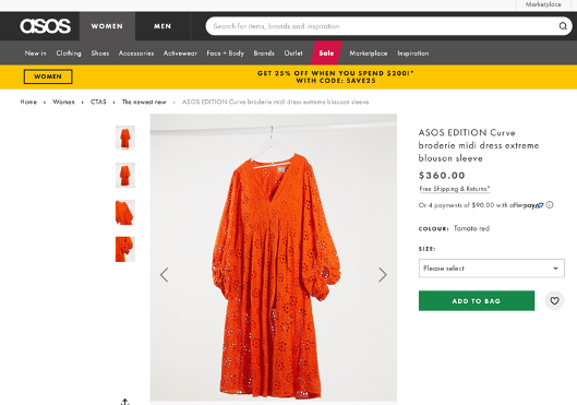
The words used for a CTA button need to nail the desired action, in most cases “View deal” or “View product” are strong signals for users to explore more on content pages. While upon landing on a product page CTAs such as “Add to basket”, “Add to cart”, “Add to bag” and “Proceed to checkout” work well. These strong and clear CTAs should be contained within a button element that brings the desired action to attention and makes it easier for the user to convert to action.
Below you can clearly see how ASOS demarks their CTA buttons.
Make payment options clear
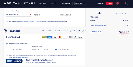
It’s highly important to indicate to users which payment options are available and even more importantly, to identify the common payment options your users leverage within your category. This should be an ongoing exercise and not a set and forget task; user behaviour changes rapidly and you must be able to tweak and adjust your options as quick as possible.
Delta Airlines do a superb option with communicating all payment options to their users, they have clearly identified common payment methods and flexible payment options such as eCredits and other forms of payment besides PayPal and Credit Card.
Allow guest checkouts
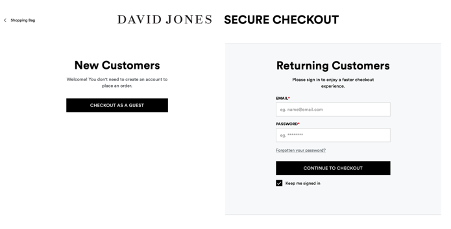
Users are more often than not turned off by mandatory account registration to eCommerce websites. The vast array of competition across all consumer categories means that we must not force our target audiences to sign-up to an account. Instead, this should be a natural progression from good UX and great product experiences that compels your customers to convert into registration and loyalty to your product/service and brand.
There are a number of key benefits for introducing a guest checkout. Firstly, you can completely avoid abandonment rates caused by mandatory account registration. Secondly, mobile users can seamlessly checkout often in two quick taps versus manually entering account details – a process which is often arduous through a form on a mobile interface. Lastly, it communicates to the user that they can make a purchase quickly without hassle and a time commitment they may not be willing to give to you with respect to a particular purchasing occasion.
David Jones provides a minimalist and classic two-way checkout process for their users.
Keep your checkout flexible
Similar to strolling through a grocery or retail store, we throw items into our basket and often change our mind. Online shopping is no different, yet some retailers fail to grasp the idea of helping their customers adjust their cart, leading to frustration and often abandonment.
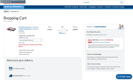
There are a number of features which can be easily adopted and will enhance a customer’s visit to your eCommerce website, resulting in a significant improvement to the UX of your checkout. Simple wins can include allowing users to easily edit or remove what they have placed in their cart. Introducing addition and subtraction controls for the quantity field, a “remove” button or close symbol are really seamless ways to empower a customer if they suddenly change their behaviour while browsing.
Harvey Norman leverage these simple wins across their shopping cart.
Value progress & the need to pause
Certain products or services require a significant time commitment from a user. Categories such as travel, entertainment and hospitality often require a lot of heavy lifting from the user to get to a point where they are willing to press that sacred “purchase now” CTA.
Factors such as substantial monetary spend, calendar organisation or the need to share information with a loved one prior to making a booking will often mean a user will not always be willing to purchase on the first visit to an eCommerce site.
Acknowledging this element of user behaviour can create a real point of difference in the eyes of your target audience. It positions you as a company that really cares and understands the intricacies of a customer journey. Simply introducing a freeze or save option to a product/service or allowing the user to share what they have found can be much appreciated.
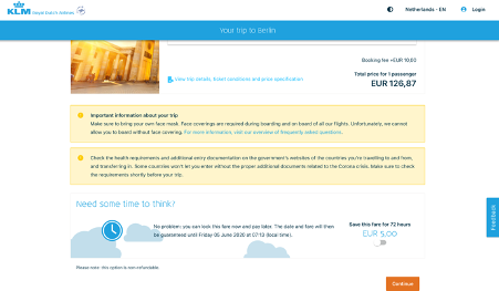
KLM do a nice job of acknowledging the behaviour of their users by allowing their users to lock airline seats to a specific date and time.
Go forth & optimise!
That’s it for this look at shopping cart best practices and methods to improve checkout conversions. We hope you’ve found it useful and food for thought. In our next deep dive, we’ll take a look at form design to improve the checkout experience on mobile devices. Subscribe to our Blog and be the first to hear about all of our new articles, from UX best practices to website performance optimisation techniques. If you can’t wait that long, download our free Online Shopping Behaviours of Today’s Australians research report today!