UX Practitioners – Errors We Make Without Even Realising
Human capacity to perceive and process information is limited. If you think about how many thousands of stimuli we come into contact with each day, it’s a wonder we can function at all!
To cope with this overload of information, we as humans have evolved a number of strategies to help us function within our busy world. As Experience Designers, understanding these strategies can help us conduct better research resulting in more accurate observations, and design interfaces that are easier to use and require less mental effort (i.e. cognitive load).
This article focuses specifically on cognitive biases, what they are, and how we can address them.
What Are Biases?
As we seek to explain the reasons and causes for behaviour, we are prone to falling victim to a number of cognitive biases and errors.
A cognitive bias is a pattern of deviation in judgment, whereby inferences about other people and situations may be drawn in an illogical fashion.
There are a variety of biases that can affect both our research and design. Some are related to the sample in general (e.g. through the sample size or the selection of the sample) whilst others are related to the way in which we process information. These processing or ‘cognitive’ biases are unconscious, affecting not only the participants of our studies and our users, but us as researchers and designers.
Why Is Addressing Human Biases Important?
Simply knowing about a bias does not help in reducing its influence. As biases occur unconsciously they will still influence us even if we know that they exist. However, there are strategies we can implement to help minimise our biases, which can lead to more valid, reliable research and more influential design outcomes.
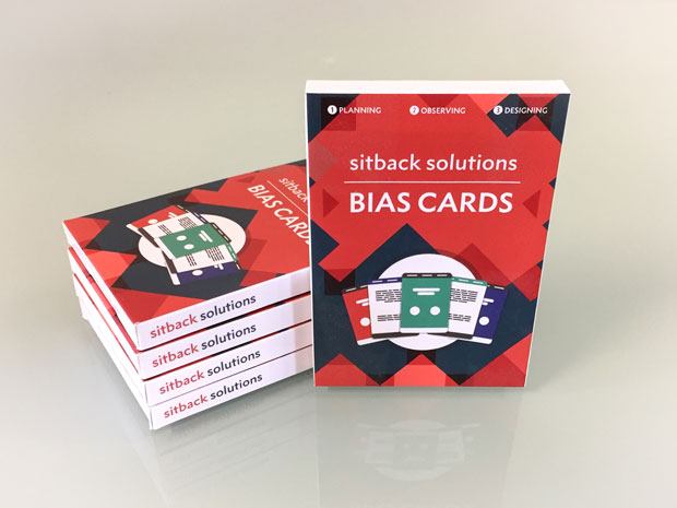
Common Biases In UX Consulting
At Sitback, our UX Psychologists have created a set of Bias Cards, summarising 25 common biases that researchers, designer and participants may hold unconsciously. They are colour coded according to five categories:
- First impression
- Influencing decision-making
- Reacting
- Predicting
- Remembering
On each card we explain what the bias is, and provide suggestions on how to mitigate.

Regularly reviewing these cards reminds us to pay attention to the biases we may have, and react strategically to alleviate them.
Below, we have outlined a sample of some of the common biases we should be aware of as UX practitioners:
Task Selection Bias
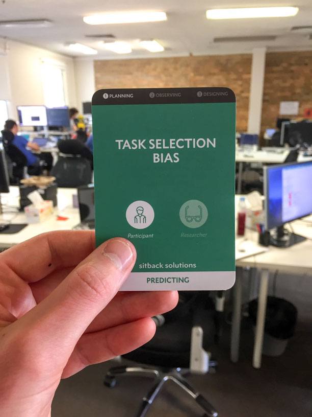
What is it?
Believing that a task or action can be completed simply because one is told to do a task. For example, in usability testing, if participants are asked to buy a product online, they will assume it can be done. Outside usability testing however, users may have their own goals and may not know whether a product can be purchased online.
What can we do about it?
Be open with the participant at the beginning of the session that they should try to behave as they usually would and that they are free to end a task whenever they feel like it. Informing them that being unable to perform a task is likely to be a system fault rather than the user’s fault can also help reduce this bias.
Mere Exposure Effect
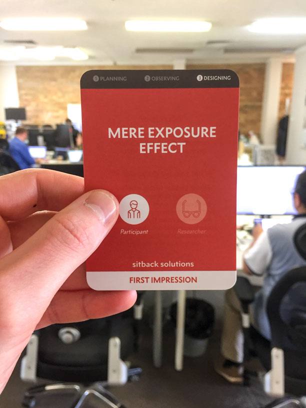
What is it?
This bias describes the phenomenon where we have a preference for something simply because we are familiar with it. This can be used to a designers advantage to familiarise users with a new interface through the use of commonly used web trends e.g. search box in the top right. We can also see this bias in usability testing where participants may dislike a new design simply because they are not familiar with it, even if it may provide a simpler solution to their needs.
What can we do about it?
As designers this bias, while it can be useful in creating familiarity with our users, can also limit our creativity thinking. In order to reduce these affects, it is important to regularly try new designs and interaction patterns. By starting new designs on a blank page rather than trying to recycle old work, the risk of being more attached to designs purely because one has seen them can be reduced.
When testing with participants, it can be useful to rotate the presentation of designs between participants to avoid any carryover between designs (e.g. the participant rating a later design higher because it resembles one seen earlier). To avoid the user discounting a design because they are less familiar with it, let them complete tasks using the interface rather than just asking about first-impressions.
Confirmatory Bias (Experimenter Bias)
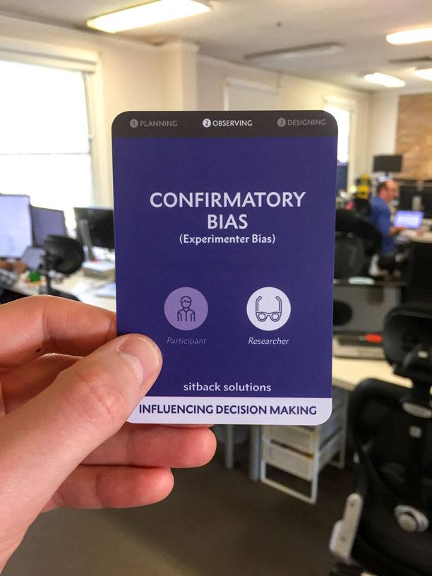
What is it?
Paying particular attention to, or selecting information that confirms the researcher’s hypothesis (or expectations of what is going to happen) over information that does not support it. This bias can also cause the researcher to ignore or reject information that goes against what they were expecting.
What can we do about it?
Being impartial and open to new ideas, and if possible use researchers and participants that are not familiar with the research questions (double-blind design).
When gathering information and designing scripts, use open-ended questions and standardised tools.
Decoy Effect (Asymmetric Dominance Effect)
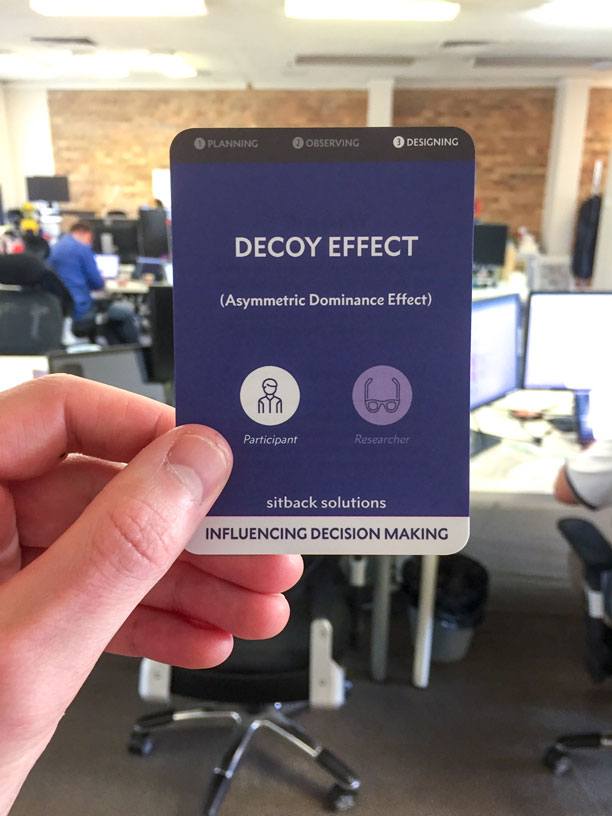
What is it?
The effect that when a choice between products (usually three) includes one option that is usually of lower quality but more expensive than the two other options (decoy) and is only introduced to distract from the cheapest option. For example, given the two choices of products, people are more likely to choose option a).
| Subscription type | Price |
| a) Economist.com subscription | $59 |
| b) Print | $125 |
Introducing a third option draws more people to choose option c), creating more revenue for the business.
| Subscription type | Price |
| a) Economist.com subscription | $59 |
| b) Print | $125 |
| c) Print & Web subscription | $125 |
In this scenario, option b) becomes the decoy because it offers less value for money compared to the other options and makes option c) appear more attractive.
What can we do about it?
Be aware of this comparison effect when displaying products to users. Decide if the business has a priority to sell a certain product and ensure when arranging content that it does not accidentally become a decoy product.