UX design process | keeping it simple
Throughout the design process for any product it’s easy to continue adding features until you’re left with a confusing mess, whether it’s a website, mobile app, or a physical product. Confused users are unhappy users, and unhappy users usually don’t take the action you’d like them to, like buying those tie-dye t-shirts from your awesome website. You know it’s their loss, but it’s also your loss and it could have been avoided if you hadn’t made it so hard!
“Simplicity is the ultimate sophistication.” – Leonardo da Vinci
Making a good first impression is important in many areas of life, both personally and professionally, and this also holds true for websites. Studies have shown that you have as little as 50 milliseconds to make a good first impression with users before they potentially decide to jump ship.
Even if your site manages to impress at first glance, users shouldn’t have to work too hard at figuring out what they should be doing next. People tend to move on from a task they find cognitively taxing if there’s an easier alternative, such as heading back to their search engine of choice and trying a different link. In fact, Microsoft says that some users’ transient attention span can be as short as 8.25 seconds. This means there needs to be a clear next step to get them to spend some of their finite mental energy continuing down the path you’ve laid out for them. Steve Krug‘s first law of usability states the average user’s perspective succinctly – “Don’t make me think!”.
Without delving into too much detail, let’s do a quick comparison between a couple of well-known sites, Google and Yahoo. According to NetMarketShare Google currently holds the majority of search engine market share globally at 65.44%, while Yahoo is sitting at only 8.28% globally.
Yahoo
Back in 1994, Yahoo was one of the biggest and most well-known websites around, offering a directory of the Internet:
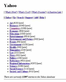
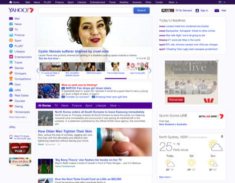
At the time, the site was about as simple as a site can get – a list of links, sorted into a set of categories. Once users in 1994 had mastered the concept of the “hyperlink”, the site itself was pretty easy to understand and use. Heading back to 2016 shows that Yahoo has changed significantly as seen on the Australian version below:

The directory has disappeared, replaced by a header linking off to Yahoo’s numerous other properties, a search box at the top, and a wide selection of news articles, advertisements and widgets. It’s not really clear what the purpose of the site is now – is it trying to be a news portal? What am I searching for when I use that search box? What’s PLUS7? There are so many different options presented (with many more as you scroll down the page) that a new user could be excused for not knowing where to start. The onus is very much placed on the user to understand the purpose of the site and decide what they want to do, completely ignoring the concept of “Don’t make me think!”.
The most popular site on the Internet had a very similar start to Yahoo back in 1997.
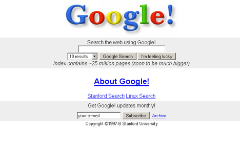
Google makes both the primary purpose of the site and what the user needs to do to get a result very clear. Unlike Yahoo, they haven’t strayed very far since:
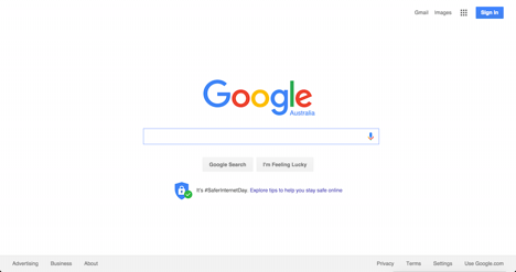
By keeping their homepage clean and simple, placing the search box directly in centre of the user’s view, Google have removed the need for the user to make any decisions beyond “what am I going to search for?”. Secondary items like the link to Gmail exist on the fringes of the page, ready in case you need them, but their presence isn’t a distraction.
A good way to look at Yahoo and Google is through the concept of cognitive load, a term used to define the amount of mental energy required to use something. This can be further broken down into intrinsic and extraneous cognitive load – the former refers to the effort of absorbing new information, while the latter is the mental processing needed that doesn’t help with understanding the content. As noted above, we have a limited amount of mental energy available to us at any given time. People naturally prefer the easier path, thus it’s important to minimise cognitive load as much as possible, particularly extraneous elements. Google does an excellent job of this, while Yahoo seems to struggle.
Simplicity is Hard
Removing extraneous elements or avoiding them in the first place is hard. The temptation to add an extra feature (we really do need a community forum on our t-shirt website!) or more options (how many colours should we offer for the care instructions label?) is hard to resist, but the simple truth is that user experience should always trump feature bloat.
Think about whether it really makes sense to add the new feature you’re considering. How does it stack up against your business goals? Does it help the user make a key decision? Will it be a distraction? Would it be better placed somewhere else in the user’s journey? Considering basic questions like these can help in making a quick initial assessment, but getting a proper answer takes research and testing to define the goals of the website, who the users are, and what their expectations may be. Having a clear understanding of all of these can really help you stay focused on what’s really important, and a variety of research methods can be used to identify them, with some of the most common being interviews or workshops with stakeholders and users.
Once the goals and users have been clearly defined, other research methods can be used to gather additional information. Surveys are a simple and relatively cheap way to put some numbers behind different ideas, particularly if you already have an existing audience or customer base using your website. A survey could be as simple as asking users to rate the usefulness of specific areas or modules on your site, or whether they would use a new feature you’ve been considering. Assuming that enough people answer your survey and you asked the right questions, you should have enough confidence in the results to help you make a decision about how to proceed with adding that weather widget on your t-shirt website (hint: don’t).
Another great option is usability testing, which gives you the opportunity to explore things in far more depth and in a number of different ways. Usability testing can be run in a usability laboratory, or in a less formal fashion such as via guerrilla testing at your local café, where you can use a fully functional website or a prototype of varying levels of fidelity. Either way, it gives you the opportunity to observe users performing a set of key tasks, allowing you to test the design and identify areas for improvement. Just as importantly, it allows you to ask why they approach something in a particular way and understand the behaviours that drive their use of your website.
While there are other options when it comes to research and testing, whatever approach you choose should ultimately provide actionable insights to help improve your design or website.