How to improve your customer experience with psychology-based UX design principles

In 2000, the average human attention span was about 12 seconds long, according to Microsoft data. By 2013, it had decreased to eight seconds, and it’s continued to fall ever since. So when you consider that — by some estimates — the average attention span of a goldfish is nine seconds, we’re actually doing worse than goldfish these days.
Unfortunately, this trend is likely to continue worsening. Humans today are inundated with an endless stream of information across different platforms and channels. The result, unsurprisingly, is less attention than before.
If you manage a business website, that’s a big deal. Fortunately, there are ways you can use psychology and design principles to hold your users’ attention for longer than eight seconds. Even if they have limited attention spans, you can maximise the attention they give to your site through user experience (UX) principles.
But how can you determine whether your website’s UX is holding your audience’s attention, or whether it’s due for a UX overhaul? Here, we’ll break down a few key takeaways from a recent webinar Sitback conducted in collaboration with Acquia on UX best practices for customer experience.
Side note: Acquia is the open-source digital experience company that empowers the world’s most ambitious brands to embrace innovation and create customer moments that matter. Acquia’s software and services were built around Drupal to give enterprise companies the ability to build, operate, and optimize websites, apps, and other digital experiences.
What Makes a Good User Experience?
It’s easy to say that a good user experience is important. But what actually makes a user experience good?
There are many different definitions of UX, but where they all overlap is in holding users and their interactions with either our websites or our products at the centre. One way to think about the different layers that constitute a good experience is with the following pyramid diagram:
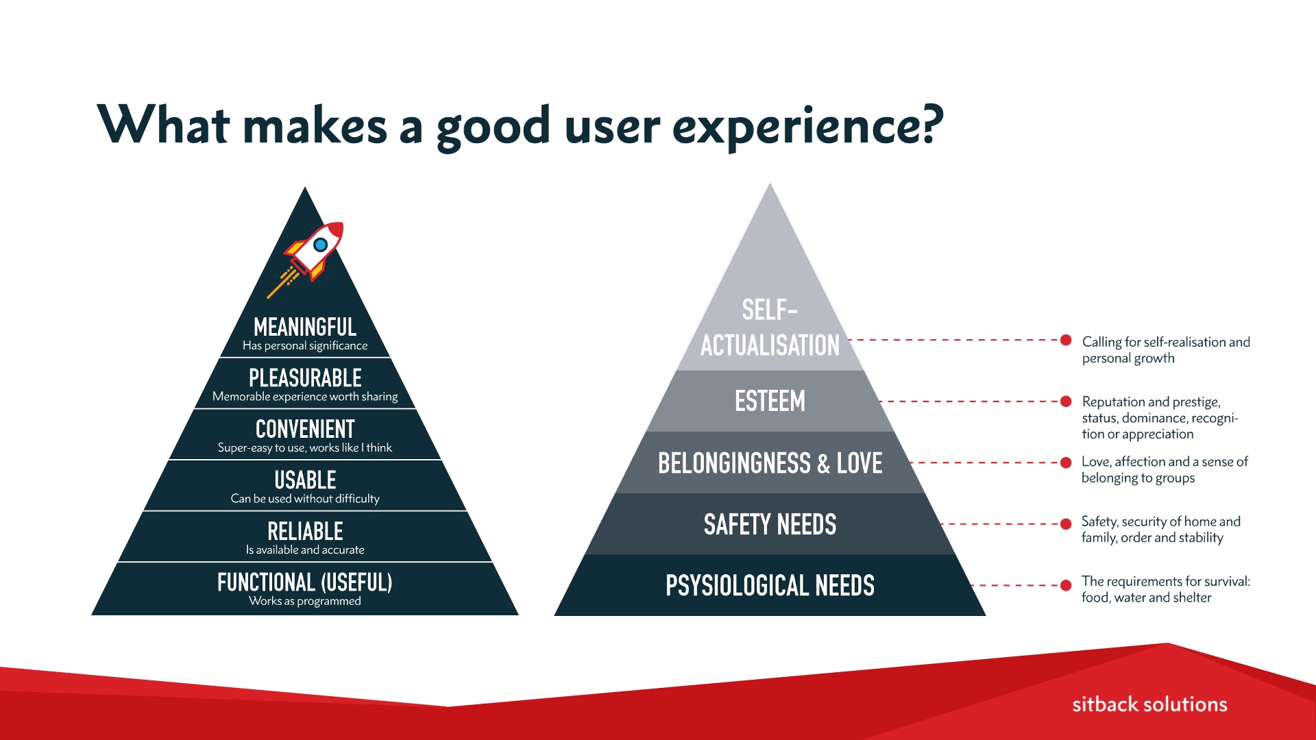
Basically, it isn’t enough for a website to be functional. To truly offer a good user experience, a site also needs to be:
- Reliable
- Usable
- Convenient
- Pleasurable
- Meaningful
As you might have guessed, this diagram is actually based on Maslow’s Hierarchy of Needs, which comes to us from psychology. Maslow’s Hierarchy of Needs argues that human motivation essentially moves from basic needs — such as physiological needs for food, water, warmth, and rest — through to needs associated with safety, belonging, and love in order to achieve things like self-esteem and self-actualisation (at the top of the pyramid).
When you apply this thinking to UX, it’s clear that — in order for us to create pleasurable and meaningful experiences for our users — we need to make sure that we’ve covered all the basics at the lower levels first. That means making sure our websites are functional, that they work as intended, and that they’re reliable. For example, if a user moves through different pages on your website, they should be able to rely on knowing that your menu will always be in the same place.
Essentially, your website needs to be usable before you even try to achieve the levels of convenience, pleasure, boldness, and meaningfulness. But how do you know if you’ve achieved the basics of good UX on your website? Who’s to say that a website is functional, or meaningful, or reliable?
There are actually several different ways to assess this. In the world of UX, we use different methods and assessments to examine a website’s usability — one of the most common is called heuristic evaluations.
What are Heuristic Evaluations?
If you haven’t come across the term ‘heuristic’ before, it’s loosely derived from the ancient Greek word heuretikos, meaning ‘inventive’, which in turn relates to heuriskein, meaning ‘to find’.
Simply put, a heuristic is a guideline or an experienced-based approach to problem-solving. Heuristics aren’t rules or proven solutions to design problems. Instead, they’re ‘good enough’ answers to problems — not the best possible answer.
In psychology, we can think of heuristics as mental shortcuts. We naturally lean on them to make decisions quickly in the real world, because we’re often faced with uncertainty. Our brains have evolved to develop these mental shortcuts to help us make quick decisions as a way to save on our cognitive powers.
UX designers have taken these psychology principles and developed usability heuristics: shortcuts for systematically and quickly determining how usable a website is. As a result, UX experts can use checklists of heuristic design criteria to quickly find flaws in a website’s experience.
Of the most widely known and widely used heuristics within UX is Jakob Nielsen’s 10 Usability Heuristics for User Interface Design:
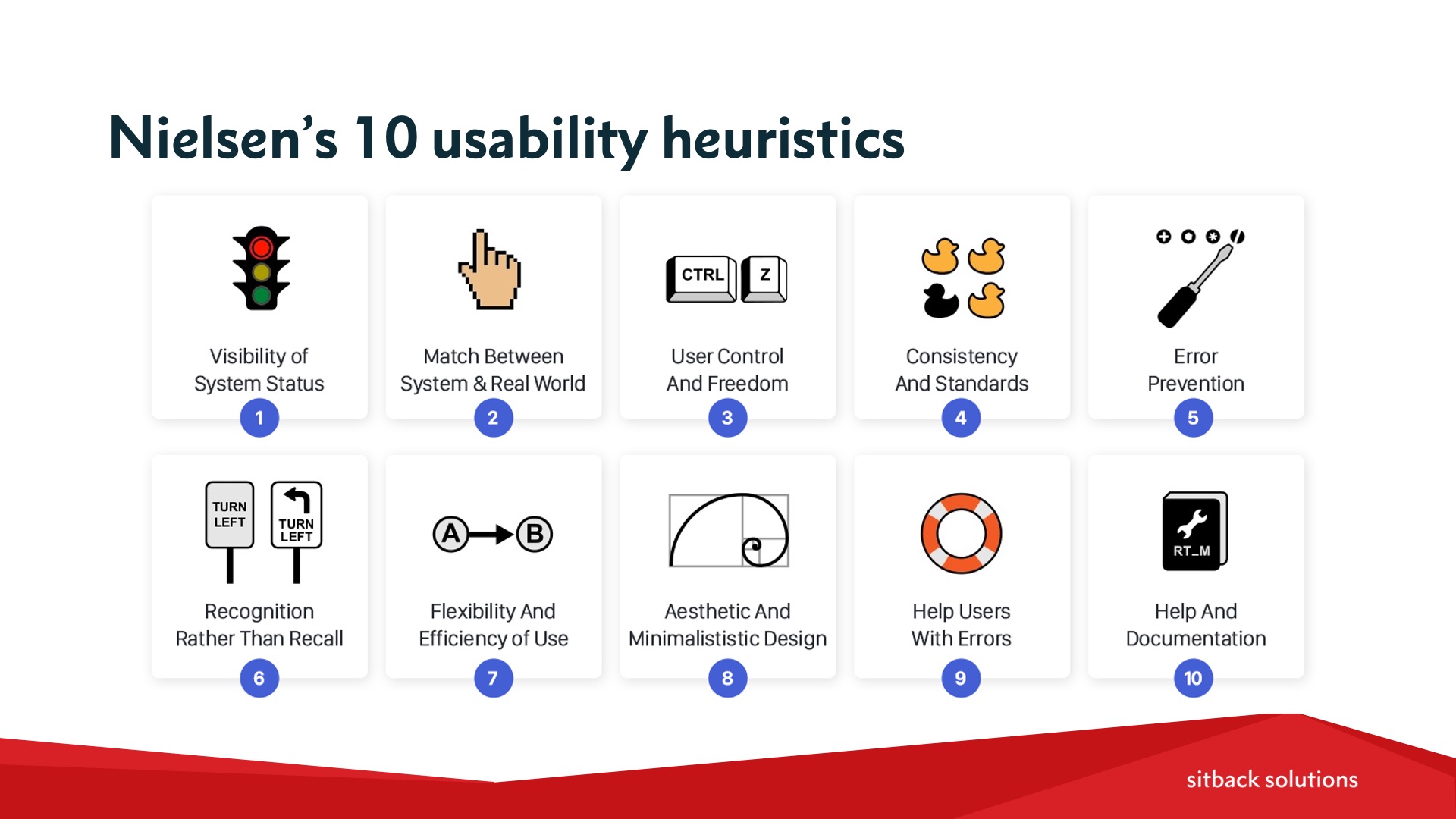
The 10 heuristics are:
- Visibility of system status
- Match between the system and the real world
- User control and freedom
- Consistency and standards
- Error prevention
- Recognition, rather than recall
- Flexibility and efficiency of use
- Aesthetic and minimalistic design
- Help users with errors
- Help and documentation
UX designers use these guidelines to evaluate mobile and web experiences. To see what this looks like in practice, let’s take heuristic #5: error prevention.
When we prioritise error prevention, we’re saying that we need to ensure the website has conditions built-in so that, if an error occurs, the user is warned about it before they take any further action.
For example, imagine you’re completing a website form, and you make a mistake that triggers a form error. At that point in time, the site should be showing you an error message so that you’re aware you’ve generated an error, as well as instructions on how to fix it. Not only will this help prevent you from making future errors, it prevents the bad experience that would occur if you completed the entire form before your error was detected.
A similar and related example would be the ability to quickly restore a file that you accidentally deleted, or to undo the sending of an email that you hadn’t finished writing yet.
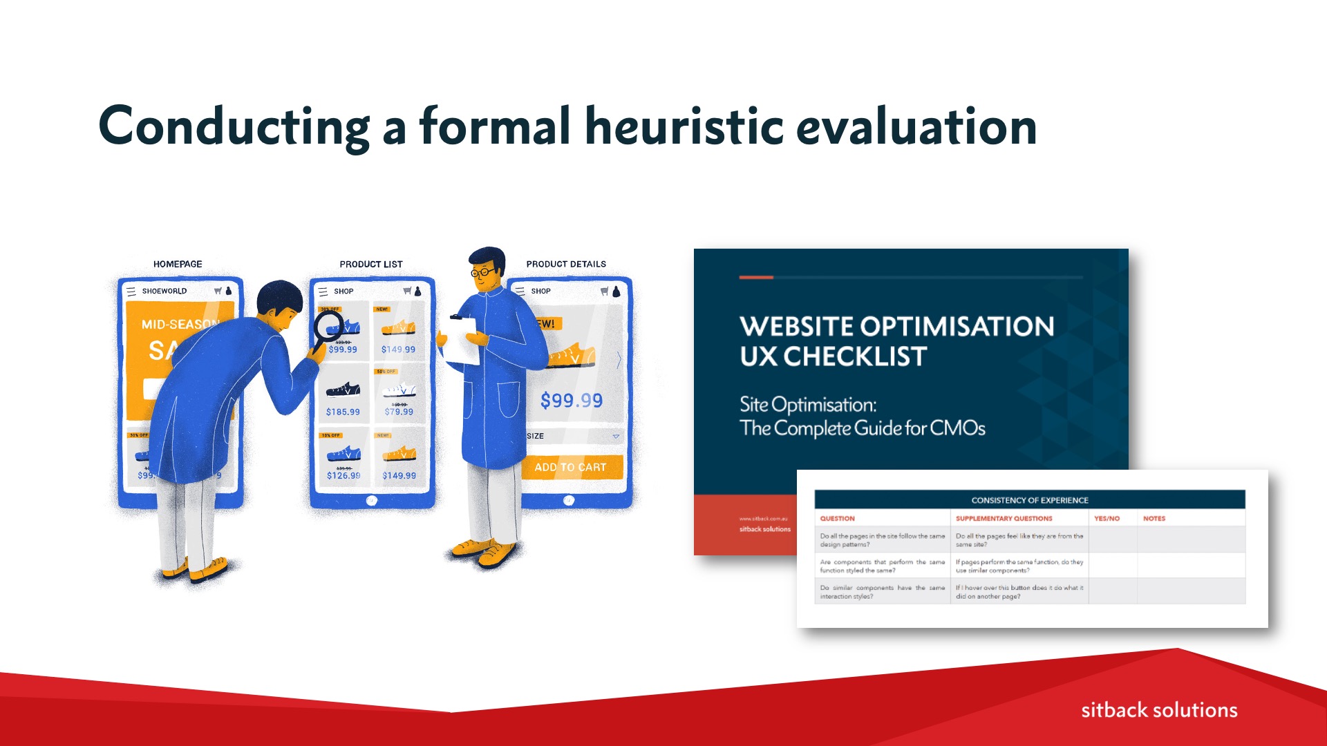
Conducting a Heuristic Evaluation on Your Website
Knowing popular UX heuristics is only the first step. Next, you need to put them to work evaluating your website.
At Sitback, we take the following steps when evaluating a website:
- First, we define what we’re going to test, whether that’s your entire website or just a part of it.
- Then, we need to identify who your end users are, as well as develop a clear understanding of what their goals are and why they’re coming to your website.
- Next, we’ll pick key tasks that your user completes on your website. From there, we’ll establish the pages the user will come into contact with when completing those tasks in order to assess any issues that break away from the chosen heuristics.
- We’ll then also flag the issues identified according to how severe and critical they are, in terms of the usability of the website.
Outside of this general process, you can conduct a more rigourous, non-biased heuristic evaluation by having two different UX consultants review your website. Then, you can assess the two reviews together to see where any overlaps and consistent findings occur. You can then prioritise those issues in the final analysis to provide the recommendations on how the issues can be resolved.
Sitback’s free UX checklist can also be helpful when planning and conducting your heuristic evaluation.
Implementing the Results of Your Heuristic Evaluation
Once you’ve completed your heuristic evaluation, your next question is what to do with the findings and how to utilise them to improve your UX and website performance.
When we work with Sitback clients, we recommend implementing as many quick wins at first as possible. Then, you can move on to A/B tests for larger, more ambiguous or contentious issues for which there may be more than one potential solution, or even look to usability testing to identify less obvious pain points.
If you have your own internal developers, you can walk them through your findings and ask them to start implementing your backlog of items. Otherwise, some of Sitback’s clients choose to carry out this work through our Support & Optimisation service, where we can organise the outcomes of your heuristic evaluation into a roadmap of activities — such as bug fixes, functionality changes, and site speed enhancements — to optimise your site.
Making the Business Case for UX
Finally, consider that — even if this all sounds great and makes sense — you may still need to get business buy-in to justify investing in-house or external resources into improving the UX of your website. So how do you do it?
There are a lot of compelling stats out there about the impact of proper UX. For instance:
- Every dollar invested in UX returns $100 (source)
- Design-driven businesses with strong UX have outperformed the S&P 500 index by 228% (source)
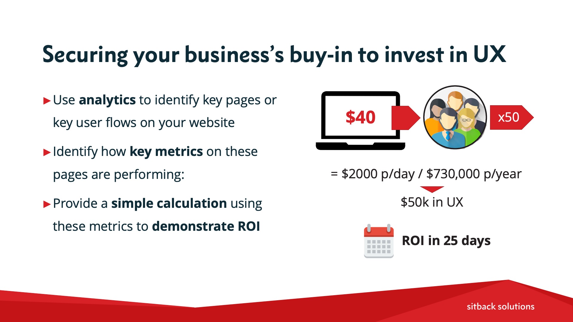
But if these data points don’t move the needle — or if the internal argument you hear is that they aren’t relevant to your company — the team at Sitback typically recommends using your analytics to identify pages or flows on your site that are underperforming industry benchmarks in order to make your case.
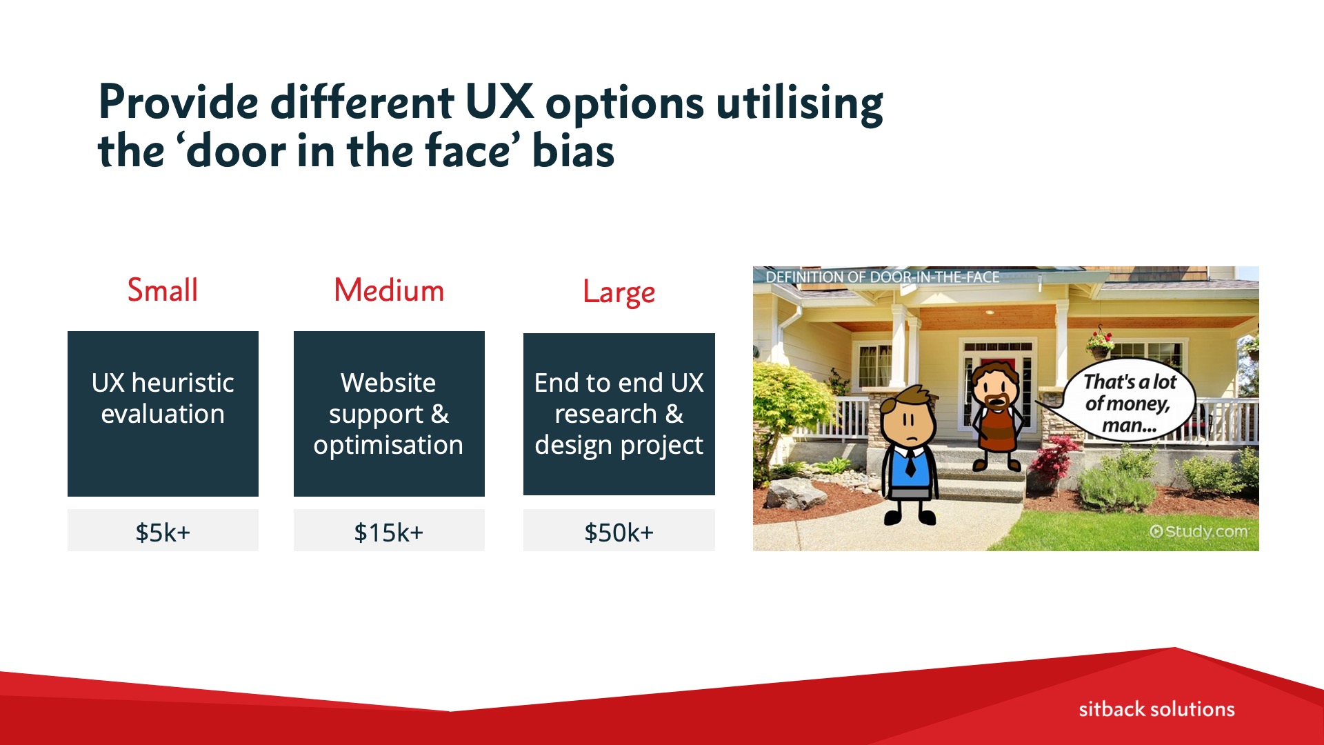
You can also get psychology on your side by presenting multiple levels of UX investment. If you start small with something like a heuristic evaluation, that’s going to be the cheapest, fastest way to get started with UX. Next, a medium-sized option would be considering a website support and optimisation service that would allow you to address ongoing UX improvements as defined in your roadmap.
Then, on the large end of the scale is your complete UX end-to-end project involving UX research, UI redesigns, and usability testing to validate design ideas. This is the most expensive and most time-consuming approach, but it’s also the most rigourous and the most reliable.
Now, to make it easier to convince the ‘powers that be’ to invest in UX, use the popular heuristic known as the ‘door-in-the-face’ when presenting these three options. Psychology tells us that people are more likely to agree to a small request after first rejecting a larger one. So if you’re finding it difficult to sell the idea of a larger UX investment, suggest it first so that when it’s rejected, you can then pitch the smaller or medium option.
If you’ve enjoyed this article and want to learn more about UX design principles and best practices that can improve the customer experience, be sure to check out the full recording from Sitback’s webinar with Acquia, below…
Or, if we can assist with more information on Sitback’s Support & Optimisation service for UX — including how to sell it to your higher-ups — reach out to connect with our team of UX experts.
Watch the video recording
{% video_player “embed_player” overrideable=False, type=’scriptV4′, hide_playlist=True, viral_sharing=False, embed_button=False, autoplay=False, hidden_controls=False, loop=False, muted=False, full_width=False, width=’1280′, height=’720′, player_id=’59391882511′, style=” %}
View the presentation slides