6 psychology principles to improve your insurance website’s UX
If ever there was a time to be optimising your website, this would be it.
With 2020 being a year of unprecedented change and disruption, it is now more important than ever to offer your customers (both current and potential) an experience that makes them feel safe, secure, and knowledgeable. Good UX (user experience) is one of the tools in our arsenal to help us achieve this; it lets us guide customers through our content in a way that is meaningful and helps them get to their end destination with minimal effort. Moreover, good UX is an integral part of the trust-building process.
Sharon Kenny, Head of Marketing and Partnerships for Bizcover, a leading online small business insurance service provider, notes the importance of UX, particularly given the impact Covid-19 has had on the industry, “Covid-19 has seen consumers looking to drop or change coverage levels in an effort to reduce overheads, but this is something everyone, especially businesses, should carefully reflect on before proceeding. Being underinsured or even uninsured can hurt more in the long run if you suffer loss or damage or have a claim made against you. This is why simple, transparent processes are so important for insurance providers and services- if customers can quickly and easily find the information they need, it will build trust and (hopefully) lead to a long-lasting relationship”.
When it comes to insurance, we know that consumers are generally risk averse – a good thing when you’re selling protection! But at times when finances, work stability, and health concerns are top of mind, it is vitally important to make their browsing (and eventual purchase) experience as smooth and positive as possible.
At Sitback, we’ve long championed the inclusion of psychology in UX design when creating human-centric solutions, and so to help you get the most out of your website, we suggest implementing some, or all, of the following psychology principles in your insurance website design:
1. Cognitive load theory
The brain can only process a small amount of information at any one time in what’s known as your ‘working memory’. Therefore, in UX design, we aim to minimise cognitive overload as people take in new information.
There are three types of cognitive load, each of which impact the way consumers learn:
- Intrinsic load – focusses on the complexity of the task itself. For example 2 + 2 = 4 has less intrinsic load than a quantum theory equation.
- Extraneous load – related to working memory capacity and a person’s ability to work with information in the moment depending on how it is presented. For example, it’s easier to explain what a square is by presenting a picture than by explaining the properties of a square verbally.
- Germane load – refers to the resources devoted to learning a new task, often breaking it down into smaller, more manageable chunks so that a person can apply what they learned previously to a new situation.
To make your online insurance quotation experience better, aim to reduce the extraneous load, while boosting germane load.
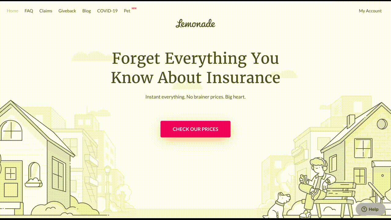
See it in action
Lemonade take advantage of the fact that you can’t manipulate intrinsic load (as a general rule), but can influence extraneous and germane load. They use minimalist design and appropriate language to minimise extraneous load, and step users through the quoting process one question at a time, from easy to hard, to focus their attention (optimising germane load).
Simply changing the order that you ask questions can dramatically improve people’s likelihood to complete a task, the time it takes them, and their perceived enjoyment of the overall process.
“When creating an insurance quote, there is almost inevitably a need for underwriting questions to be answered. Customers can become frustrated with the number of queries, so at BizCover we work with our insurer partners in an effort to ensure that we only ask a minimum number of relevant questions – this saves time and allows us to very quickly deliver accurate quotes for our customers. Being clear upfront about the steps involved, why we need the information or why we may need to call for more information, sets expectations for customers and makes their experience more positive”
Sharon Kenny | Head of Marketing and Partnerships, BizCover
2. Peak-end effect
People are notorious for judging experiences based on how they felt at the peak of the experience and at the end, rather than based upon their whole experience.
The Nielsen Norman Group define the peak-end rule as:
“a cognitive bias that impacts how people remember past events. Intense positive or negative moments (the “peaks”) and the final moments of an experience (the “end”) are heavily weighted in our mental calculus.”
When applying this knowledge to insurance websites, it’s important to end the quoting process on a high to take advantage of the peak-end effect. Ensure that customer engagement is rewarded with clear next steps – readily available help options, the ability to opt out of unwanted future communications, or something to get them excited like a trip planner for travel insurance websites – to leave them with a positive memory of their experience.
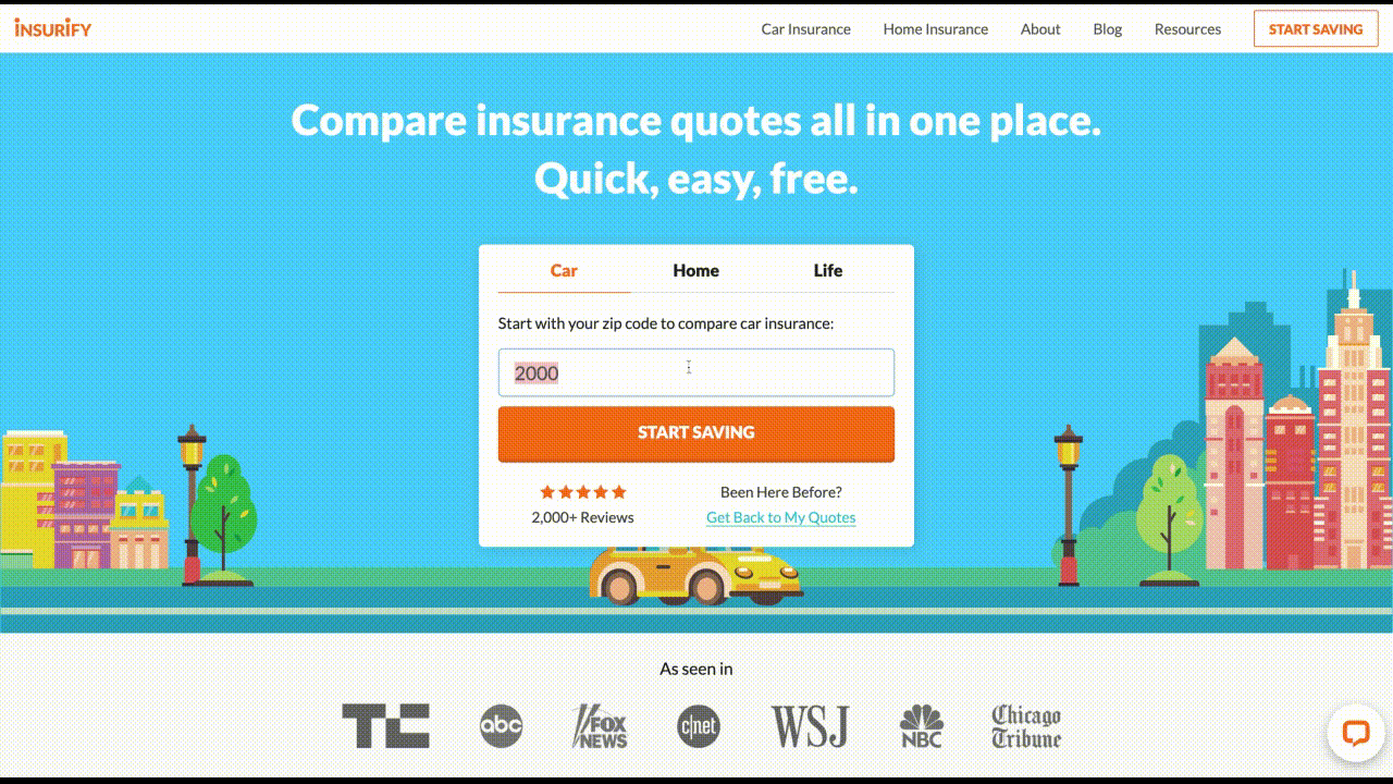
See it in action
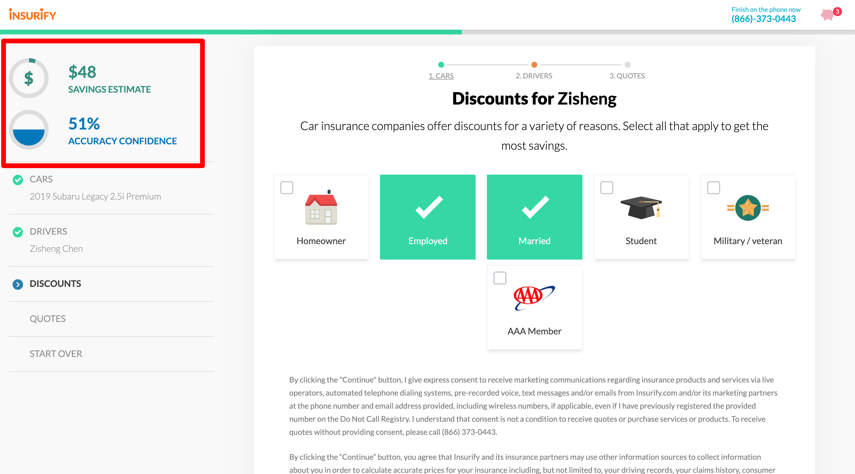
Insurify does this by producing multiple peak moments throughout the quoting process. Users are shown new notifications based on the selections they make outlining their (estimated) cumulative discounts as they move through the questions, and receive a readout of the accuracy of their estimate at completion of the quote. This makes for a positively memorable experience.
3. Hick’s Law
Ever been presented with a large range of ice cream flavours to choose from, but struggled to select one? That’s Hick’s Law in action.
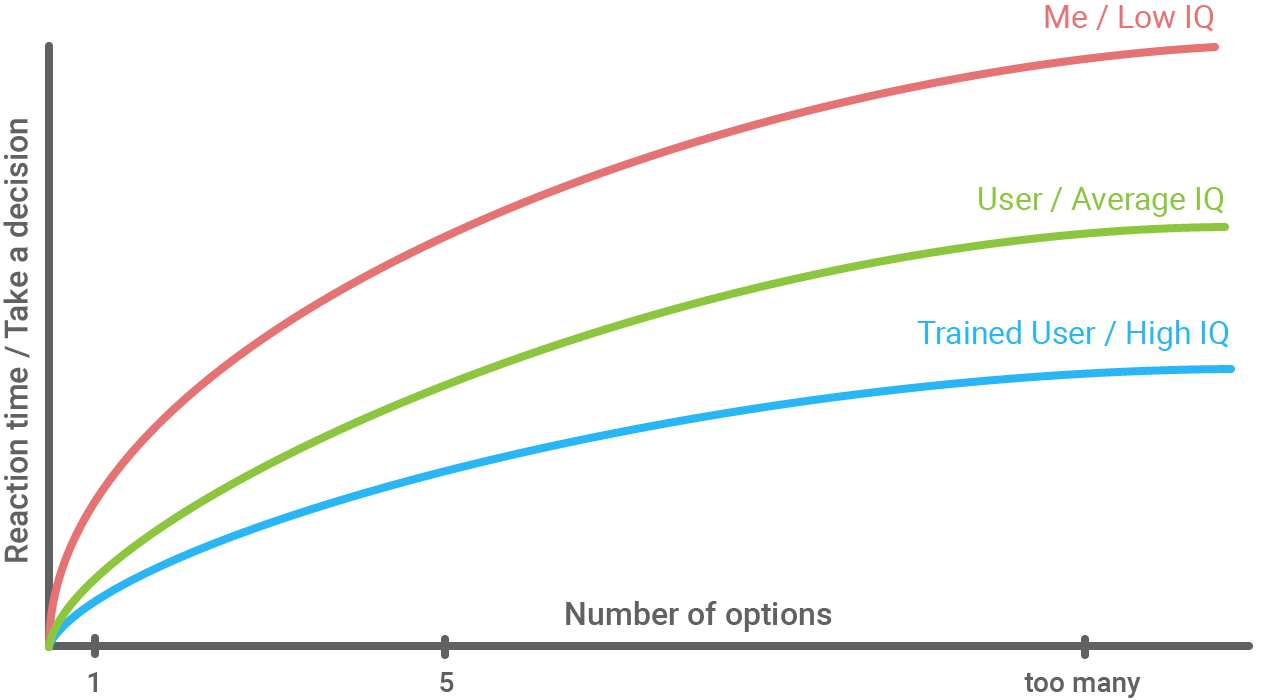
When it comes to product selection, the more options people are presented with, the longer it takes for them to choose the right one for them. This is due to the user needing to interpret the options and make a decision (which can be overwhelming).
Given that insurers typically offer a large range of products, with differing tiers for each, there are ways to minimise choice load for potential customers, for example:
- Identify the most popular products and ensure they’re prominently displayed
- Ensure there are clear product groupings, so that users can easily navigate the right path to selecting the best option
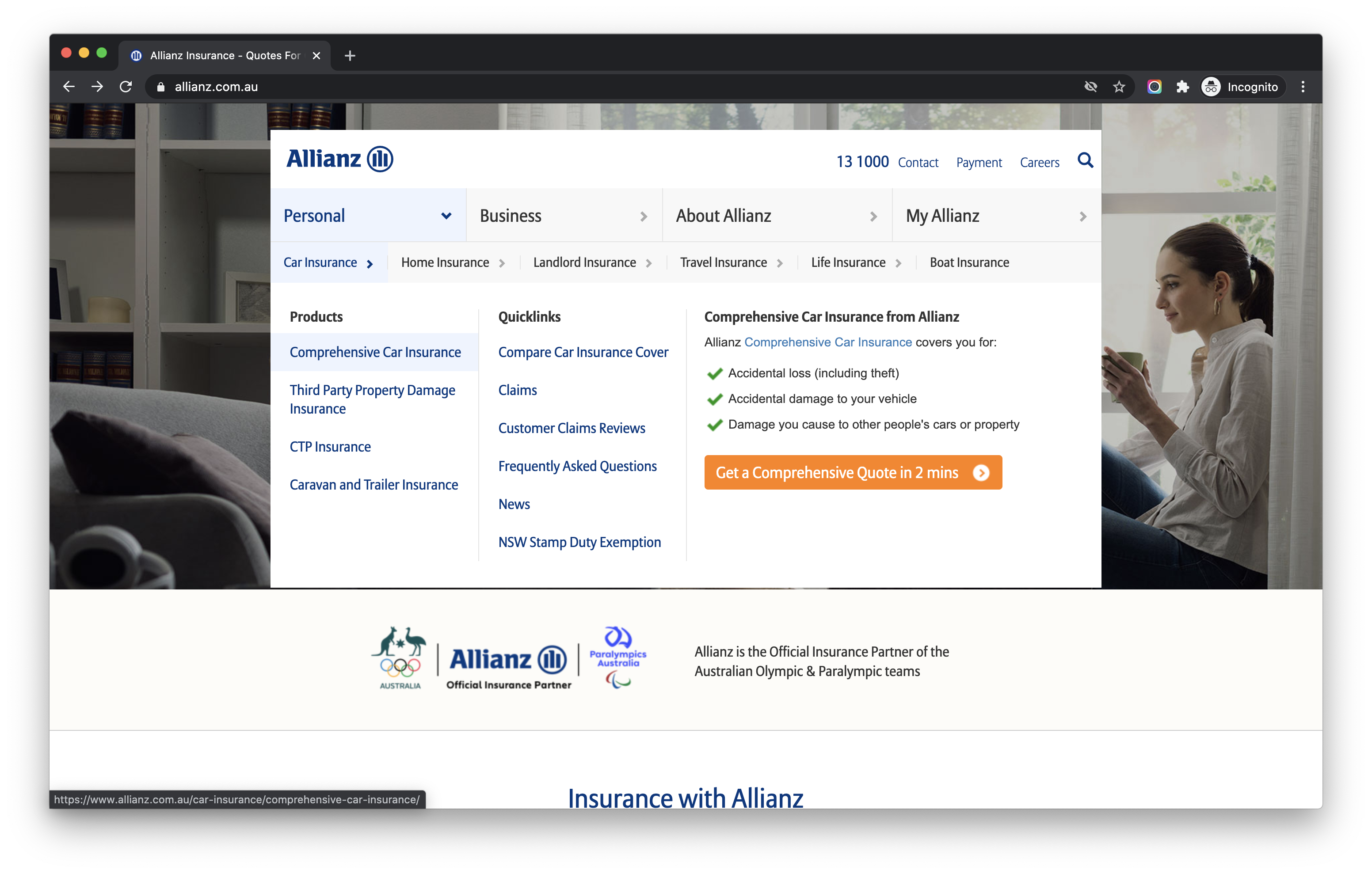
See it in action
Allianz does this well in their navigation. Using broad personal and business categories, then revealing different insurance options within those categories, for example:
Personal > Car Insurance > Comprehensive Car Insurance
“When it comes to insurance, trust is critical. In essence, insurance is a contract customers can trust when things go wrong. For this reason, building trust mechanics into your UX is vital. With Advisr, brokers with customer reviews are chosen by customers more often than brokers without reviews. In fact, reviewed profiles are seen up to 25x more than non-reviewed ones. That is one reason we have individual reviews for people and brokerage reviews (we can now pull in Google My Business reviews). Customers need trust signals to assist in their decision making.”
Andy Jamieson | CEO, Advisr
4. Serial position effect
When presented with a long list, people are more likely to remember the first and last options, disregarding much of the information in the middle after a short period of time. This memory effect is partly due to working memory capacity. Early options in a long list are likely to be remembered because they have a greater chance of being transferred to long-term memory because a person can rehearse them and this results in the primacy effect. On the other hand, the recency effect comes about because options later in a long list can be recalled easily from working memory.
To ensure potential customers remember the most important information from a long list of options, position key details at the start or the end of the list.
See it in action
A really simple opportunity to see this in action is to Google ‘insurance’ and take a look at the positioning of the ads at the top and bottom of the page – a perfect example of the serial position effect in action!
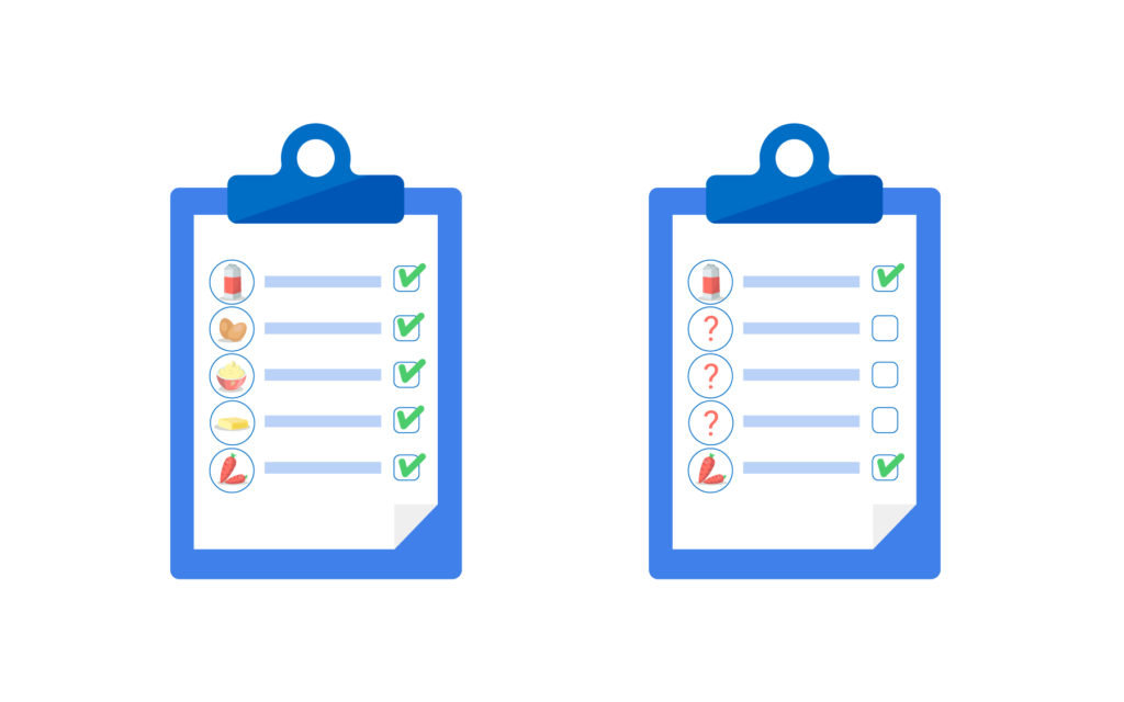
5. Zeigarnik-Ovsiankina effect
The Zeigarnik effect occurs where people are more likely to remember an interrupted task later than a completed one, while the Ovisankina effect is the tendency for people to resume an interrupted task because the incomplete task interrupts the feeling of closure that comes with finalising a task.
Think about why you’re so hooked on that new tv series or novel, and feel the need to get to the end. That desire to finish can be transferred into insurance websites by including progress bars for quotes and forms, showing your potential customers just how close they are to the end.
Adding an option to save a quote part way through the process and sending follow up emails to remind the user to complete the task is another way of taking advantage of this psychological phenomenon.
See it in action
Insurify does this well too, showing users the accumulating discount percentage based on their answers to a list of questions. In addition to a progress bar, they show the ‘accuracy’ of the quote increasing as their potential customers provide more information as they move through the quoting process.
The accuracy percentage never reaches 100%, meaning users are more likely to engage with one of the companies shown on their comparison list in order to resolve the feeling of disruption the imperfect score brings.
6. Psychology of colours
If you’re a marketer, there is a good chance you’ve heard of the psychology of colours and may have even worked with the concept while creating brand guidelines.
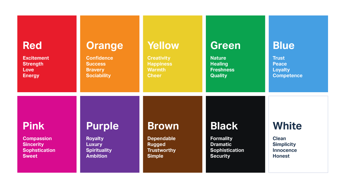
Research shows that people often assign attributes to different colours. For example, blue is often associated with trust, while red tends to instigate action. More examples can be found here if you’re interested in learning more.
For web pages with high traffic, A/B testing is a great way to see how certain colours work for your audience across different elements of your interface (remember, when testing keep all but one variable the same!). No one colour is universally ‘better’, so it pays to test and find out what works for your website.
See it in action
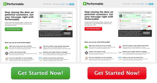
Performable (now a subsidiary of Hubspot) A/B tested red and green Call To Action (CTA) buttons and found that the red button outperformed green by a whopping 21 per cent. The result was different than expected – the Performable team assumed green would win given it means ‘go’ in western society and worked with their colour palette, which just goes to show that rarely does basing decisions on intuition work in our favour. Instead, research and testing provide a more accurate result that better suits the needs and wants of our customers.
That’s it for this round up of six psychology principles that can be used to improve the user experience, and ultimately customer satisfaction, of your insurance website. I hope you’ve found it useful and thought provoking!
If you’re keen to learn more about how these principles (and more) can be applied to your website, reach out today and start a conversation with our team of psychologists and UX experts.
Go forth & optimise!
That’s it for this look at psychology principles and methods to improve the user experience of insurance websites. We hope you’ve found it useful and food for thought. If you have, consider subscribing to our Blog and be the first to hear about all of our new articles, from UX best practices to website performance optimisation techniques. If you can’t wait that long, download our free Online Shopping Behaviours of Today’s Australians research report today and gain more insight into the trends of online commerce right now.